THERESIA K.
Graphic/ UIUX Designer
based in BSD, Serpong


pintaria.com
Left: Existing Pintaria.com (Before revamp)
This is a team project on revamping the UI for Pintaria.com.
Platform: Desktop
Role:
-
Propose a sitemap and user flow for the new Pintaria Homepage and "All Course" Page.
-
Create Low Fidelity UI of the proposed design
-
Create High Fidelity UI
Background
Pintaria offers three types of services, Degree, Courses for Prakerja, All Courses for Public. We want the Homepage to provide all important information and services for Users to know.
The Problem with current website
-
Homepage does not give clear knowledge on what Pintaria is and its services.
-
Confusing Information Hierarchy
-
Bad UI UX on Testimony
-
Inconsistent UI on Course Categories.
Problem:
Testimony Section


On the Testimony Section, many information is presented in
Problem:
View ALl Category
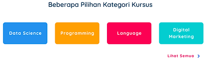

Inconsistency is found on the Category Section. On the Homepage, several categories are displayed as texts with colorful rectagles as the background.
After user taps "Lihat Semua" (View All), user goes to All Categories Page where the categories are displayed as Icons.
1. Create Sitemap
Below is a sitemap that I proposed to show the journey for general users who wants to view All Courses on Pintaria.
.jpg)
2. Low FIdelity UI

A Low Fidelity design is created as a draft which is then turned into a simple prototype to be present to Product owners.
The prototype lets us view the overall flow and experience and gives us room for revisions before moving on to the High Fidelity Design.
3. high FIdelity UI
homepage (New)


After approval from Product Owners and discussion with Developers, a High Fidelity version is created to get a preview of the first design draft.
All Course Page
( Before )

( After )

A comparison on the All Course Page.
Changes:
-
Carousel Banner
-
Categories are moved up. Sliders previewing several categories and "view all" icon at the last.
-
"Course according to Profession"is moved up and given a different design.
-
Added "Training Provider" Section
-
Added "Testimony" from Users who took "All Course"
-
Redesigned Footer
Overall Design flow for "All Course"

After approval from Product Owners and discussion with Developers, a High Fidelity Prototype is created to get a preview of the first design draft.
We kept the design for Detailed Course which was done by my teammate.

On both page, we gave a carousel banner to feature various announcements and promotions.
On the Homepage, we also featured all three products (services) divided into sections accompanied by visuals representing each product.
When a visitor clicks on one of the button on each section, the visitor is then taken to its dedicated page, in this case the All Course Page.

On the previous design, the Course Category was placed on the bottom of the homepage. We moved it to the All Course Page where it is better suited, and to help users find a specific category easily, it is placed at the top part of the page.
Icons are used aswell as on the list of Categories Page.